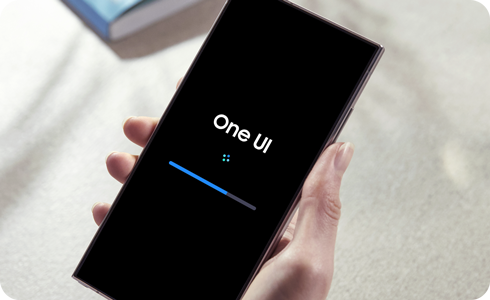
Samsung Phone Update: More AI, Weird UX Changes, Some Cool New Features!
 The May 4th update for Samsung phones in the S20+ series is a huge update that basically changes the entire phone experience!
There are some good changes!
The improved charging and battery life indicators are a much needed UX improvement. Before the update, plugging in your phone would place a giant circle on the center of the screen that would take up a good 50% of the screen real estate. After the update, the same action now shows a tiny indicator in the top right corner. This means the indicator of battery life and charging no longer gets in the way of videos and other full screen content. Much more bearable!
We now have a "Modes and Routines" feature that lets us set up presets to switch between for various settings. For example, there's a preset for Theater, Driving, Exercise, etc. I could see myself using Theater mode a lot to quickly set myself to DND mode but with a timer to also go back to normal in 3 hours in case I forget to change back manually. That timer feature to switch back is what makes this incredibly useful.
The rest is probably bad.
Unfortunately, this UX update comes with a bunch of AI feature pushes, which weren't as prominent on the phone before this update. The AI is definitely faster to respond now, which makes it more usable, but if you don't like the idea of using AI features, they're harder to avoid now. The phone used to use a very out-of-the-way AI called Bixby. Now, the phone uses Google's Gemini by default, but the AI can be switched back to Bixby if you liked it.
Also, the classic UX of the phone has been modernized in a very bad way, making everything bigger and reducing accessibility and functionality in some ways. Everything on the swipe down menu is now a lot more rounded, giving less functional space for things like text. The quick settings are no longer taking up space at all by default, only showing up if you swipe down a second time on the top right. Before this update, the quick settings were on the main swipe down menu and could be expanded. This is an unnecessary change and I wish I could go back to the old way of doing things.
The quick settings menu looks a lot less readable. Before the update, the quick settings buttons had text under each option to easily know what every option is. After the update, all text is gone, and getting to the full list of options takes an extra action. There is a new Assistant Menu you can turn on to get a similar experience to the original menu, but it doesn't go back to the way the phone menu used to work; It just adds an extra customizable menu. I would much prefer to see this customization applied to the main swipe down menu.
Some people will hate this update. Others may like it. I personally like it more than I hate it, but it's taking some getting used to.
